Brand guidelines
How to use this identity.
Everything needed to produce something that looks like Operation: RallyPoint — in either medium. If you are working on a print job, the short version is: use the color lockup, and send your vendor the Illustrator master.
Start here
Print and web use different assets on purpose.
- Logo
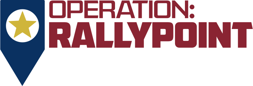
- Full color — navy pin, gold star, crimson wordmark
- Headline type
- American Captain (AMCAP Eternal + Patrius)
- Why
- The brand typefaces are licensed for print, and color reproduces reliably on paper.
Web
- Logo
- The same lockup, recolored per theme. On dark: field-khaki pin, white star and wordmark. On light: the full-color version above.
- Headline type
- Big Shoulders Display
- Why
- The brand typefaces cannot legally be webfonts, and navy on the dark ground measures 1.46:1 — invisible.
Also start here
One word, always with the colon.
The name is Operation: RallyPoint. The colon is part of it, and RallyPoint is one word. Case follows the setting, not preference.
Do
- In running text, sentence case: Operation: RallyPoint. Capital R, capital P, no space between them.
- Where the setting is already all-caps — the wordmark, mono labels, anything under
text-transform: uppercase— it reads OPERATION: RALLYPOINT. CSS handles that conversion, so still write RallyPoint in the source. - Short form ORP is fine internally and in file names. Not in donor-facing or veteran-facing copy.
Don't
- Never Rally Point as two words, and never without the colon. Both were in use before and both are wrong.
- Never RallyPoint alone — Operation: leads.
- Never hand-type an all-caps version into source to force the look. Let the stylesheet do it, or the string breaks the moment the styling changes.
One exception, and it is deliberate. The registered legal name is Operation Rally Point of Walton County — no colon, two words — and it appears in that form in the 501(c)(3) disclosures on Accountability and Donate. That is the name as filed. Do not restyle it to match the brand; a tax-status claim has to use the name on the filing.
01 — The mark
A map marker, not a flag.
A rally point is a coordinate: a place you are told to reach, where someone is waiting. The mark says location and rendezvous. That is the whole idea, and it is why this identity does not lean on flag imagery.
Construction
- Clear space equals the width of the pin on all four sides. Nothing enters that field — no type, no rules, no image edge.
- Minimum size is 24px on screen, or 8mm tall in print. Below that the star fills in and the shape reads as a blob.
- The circle is a true knockout. It is a hole, not a white disc — it shows whatever sits behind it. Over photography, place the mark on a solid patch or give it a backing shape.
- Never outline it, add a gradient, apply a drop shadow, or set it inside a roundel.
Minimum size, demonstrated
96px
56px
32px
24px — floor
16px — fails
02 — The lockup on screen
One file, three fills.
The lockup is three separately-filled paths — pin, star, wordmark — driven by CSS variables. That is what lets a single inlined file serve both themes without duplicate artwork, and it is why the wordmark on this site is real artwork rather than type.
Dark theme
- Pin
#978963field khaki · 5.02:1- Star
#FBFAF6white- Wordmark
#FBFAF6white
Light theme
- Pin
#0A3161Rally Navy · 12.38:1- Star
#CFB53BRally Gold- Wordmark
#8A2432Rally Crimson · 8.46:1
The gold star is the weak point on light. Because the circle is a knockout, the star sits on the page rather than on the navy, measuring 1.95:1 against a near-white surface. Logotypes are exempt from contrast requirements, so this is compliant — but it is faint at small sizes.
The alternative is the khaki-and-black inverse: a field-khaki pin with a near-black star and wordmark, mirroring the dark treatment. Switch by setting --logo-pin: #978963 and both --logo-star and --logo-word to#171911 in the :root block oftokens.css.
03 — Misuse
Six things that break it.
- Do not stretch it. Scale proportionally, always.
- Do not recolor the mark arbitrarily. Color lockup for print, khaki or single-color for everything else.
- Do not fill the knockout. The circle stays open.
- Do not place it on busy photography without a solid backing patch.
- Do not add a flag, eagle, or ribbon. The category is saturated with them; that is precisely what this identity avoids.
- Do not rebuild the wordmark by typing it. The lockup is outlined artwork with specific kerning. Use the supplied files.
04 — Color for screen
Two themes, both required.
Every value was measured against its intended surface, not chosen by eye. Contrast ratios are shown as dark / light. All clear WCAG 2.1 AA; most clear AAA.
| Token | Dark | Light | Role |
|---|---|---|---|
| Field ground | #14170F | #F2EFE8 | Page background |
| Surface | #191B15 | #FBFAF7 | Cards, header, primary surface |
| Raised | #23261D | #EAE6DB | Story bands, input wells |
| Border | #66675E | #949186 | Rules and borders · 3:1 minimum |
| Heading | #FBFAF6 | #171911 | Headings · 16.6:1 / 17.0:1 |
| Body | #E9E6DA | #2E3128 | All running prose · 13.9:1 / 12.7:1 |
| Secondary | #C9C3B3 | #53564A | Short text only · 9.9:1 / 7.2:1 |
| Accent | #C4B183 | #5F5638 | Actions, figures, the mark · 8.2:1 / 7.0:1 |
| Ember | #B8442C | #A8371F | Crisis path only · never anything else |
| Ember ink | #E08163 | #A8371F | Ember as text · 6.2:1 / 6.2:1 |
Both themes ship. This is not a preference toggle.Veterans with TBI or blast injury often have photophobia and need the dark theme. Astigmatism causes halation — light text blooming on dark grounds. Cataracts and age-related low vision usually favour light. No single theme serves all of them.
Ember is a background color, not a text color.#B8442C as text on the dark surface measures only 3.23:1. When ember must be text, use #E08163. And ember appears on the crisis path only — never a newsletter button, never a hover state. That separation is what lets a veteran in distress lock onto one signal.
05 — Color for print
The official palette.
These are the logo's own colors, taken from the Illustrator master. They appear on paper, not on the website.
The CMYK values are indicative, not authoritative.They are a straight arithmetic conversion with no color management, no paper stock, and no press profile. For anything that matters — letterhead, banners, challenge coins — give your printer theLab values or the Illustrator master and ask them to match against a physical swatch book on your actual stock.Do not approve a spot-color match from a screen.
06 — Typography
Four roles, one job each.
Screen
- Big Shoulders Display — every headline. Condensed, squared, industrial; the closest open face to the American Captain in the logo.
- Archivo — body copy and interface.
- JetBrains Mono — coordinates, statistics, labels. Always tabular figures where digits stack.
- Source Serif 4 — reserved for veteran testimony. It signals a person is speaking before a word is read. Never used for marketing copy.
- American Captain (AMCAP Eternal and Patrius 02 FRE, by The Fontry) — headlines and the wordmark.
- Archivo or any clean grotesque — body copy.
- Set headlines tight. American Captain is drawn for close setting; loose tracking makes it look like a different face.
Display — Big Shoulders Display 800
No veteran holds the line alone.
Body — Archivo 400
Lodging tonight, not paperwork in six weeks. We meet veterans in crisis where they are, then we get them somewhere better.
Testimony — Source Serif 4
I called at four in the afternoon. By nine I had a bed, a shower, and somebody who already knew my last name.
Data — JetBrains Mono 500
SECTOR GA-30655 · RESPONSE <24 HRS · 33.7948° N 83.7135° W
American Captain cannot be used as a webfont. Both files carry an fsType of 4 — preview and print embedding only. That permits embedding in a document for viewing and printing. It does not permit@font-face, which would make the font file downloadable.
The logo keeps the real typeface because it is outlined artwork — no font is served at runtime, which is standard and permitted. For the same reason the font files arenot downloadable from this page. Send print vendors outlined artwork, or license the fonts directly from The Fontry.
07 — Voice
Plain, specific, never pitying.
Do
- Lead with what happens: “Lodging tonight, not paperwork in six weeks.”
- Use real units. “One night” beats “your generous support.”
- Write to a veteran as a peer, not a case.
- Say what we do not know, and what we did with the money.
Don't
- No “heroes,” “fallen,” or “sacrifice” as decoration.
- No pity. Nobody is asked to prove their situation was bad enough.
- No invented numbers. A figure with no source does more damage than no figure.
- No full name plus photograph without written consent on file.
08 — Assets
Download.
All logo files are vector, so they scale to any size without loss. The mono files use currentColor — one file covers every context and both themes.
- Full lockup — color
logo-full-color.svgPrint, letterhead, grants - Full lockup — mono
logo-full-mono.svgWeb, any single color - Full lockup — black
logo-full-black.svgOne-color print, fax, stamps - Mark — color
mark-color.svgPrint, when the pin stands alone - Mark — mono
mark-mono.svgWeb, favicon, app icon - Mark — black
mark-black.svgEmbroidery, engraving, one-color - Wordmark only
wordmark-mono.svgWhere the pin appears separately - Illustrator master
operation-rally-point-logo-master.aiSend this to a print vendor



Producing something and not sure? Call (678) 276-6374 or use the contact form. We would rather answer a question than see the mark stretched.